Be.Source #Solidarity
A new source of solidarity
The brief
As a private foundation, the main purpose of be.Source is to help non-profit organisations specialised in the assistance of disadvantaged older citizens, by sharing information and know-how, as well as by giving financial support.
be.Source plays an important role in encouraging seniors to take part in voluntary initiatives designed to help other Seniors in Need.
As this topic is universal and concerns all of us, be.Source wants to position itself as a major contributor to Seniors in Need towards relevant organisations, institutions and the political world.
Therefore their full visual identity needed to better reflect their positioning and mission.
What we did
A stronger visual identity, a better structured website and a more explicit message.
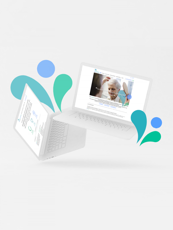
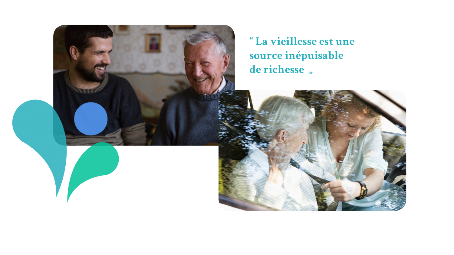
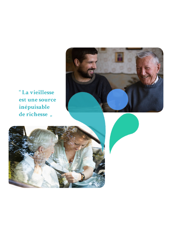
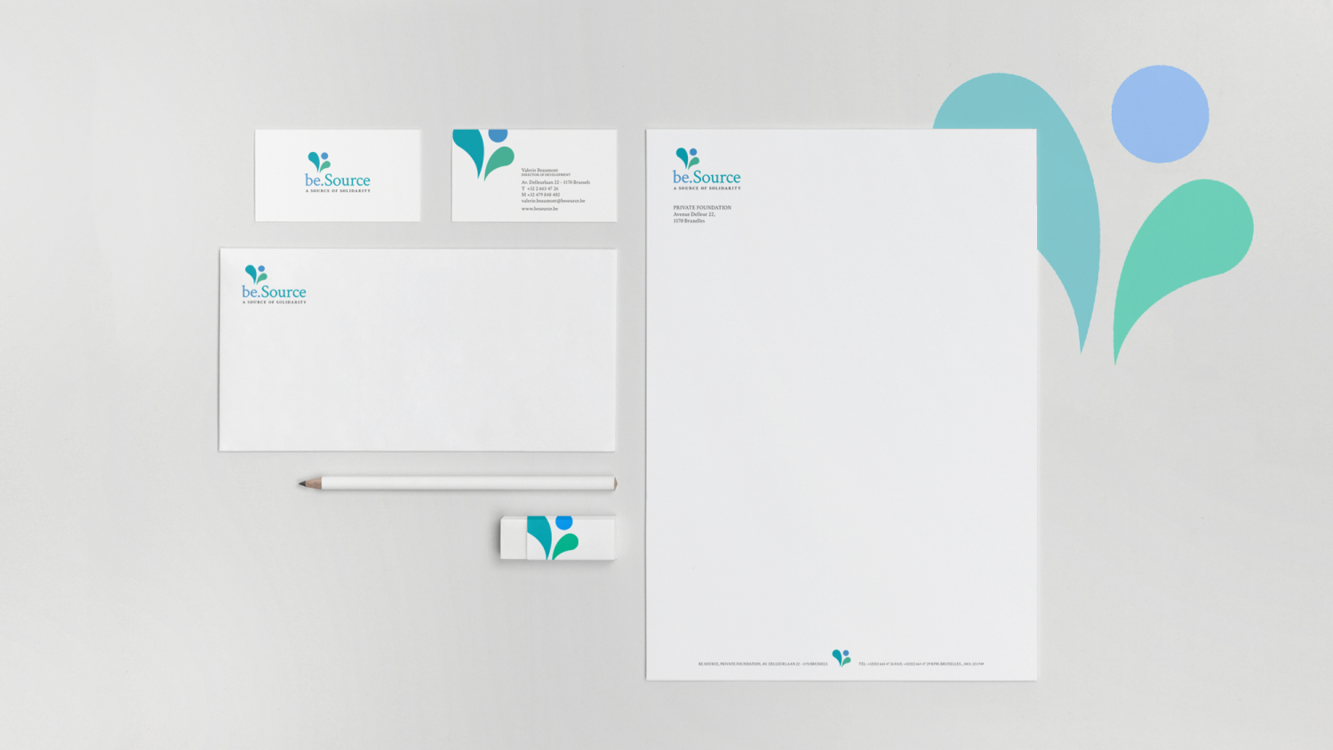
Our work started with their rebranding. A refined and elegant logo was designed to better reflect their mission. The new colours and typography are modern and professional.
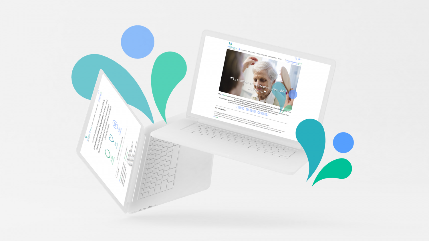
The new website was completely rethought with a revised architecture, new pages and sections which gives a better overview and an easier navigation to partners, organisations and volunteers.
The last phase of our work was to rewrite all the foundations content. Their message is clear and straightforward with a tone of voice that empowers and reflects the importance of their work
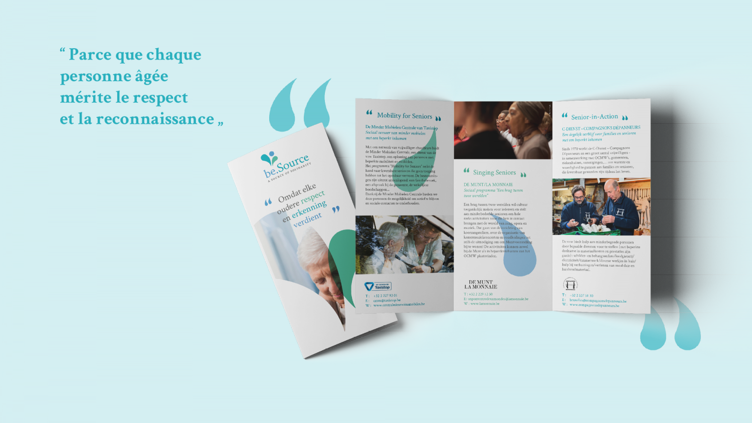
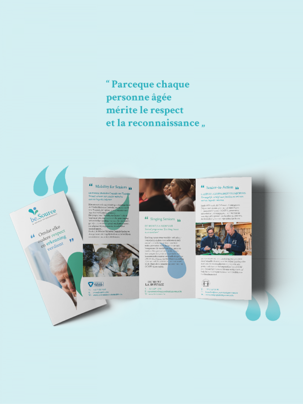
A new brochure dedicated to their main partners, outlining the mission and programmes, was designed within the new identity.
The upcoming phase
The upcoming phase is to adapt and promote the new identify throughout the different communication tools.
The new identity will be used throughout the different communication tools such as stationery, office supplies and newsletters, allowing be.Source to clearly and powerfully communicate what it stands for.
- Logo and brand identity
- Website
- Brochure
- Business communication tools
